
Background
After President Barack Obama was reelected on November 6, 2012, it took Fox News just one day to publish an article titled "Five ways the mainstream media tipped the scales in favor of Obama." The left was just as blunt, such as Salon's article two months later, "12 most despicable things Fox News did in 2012."
Both sides in this debate are correct that a functioning democracy relies heavily on a fair and free press during elections, so it is important to use the data from 2012 to answer a few key questions: How does Presidential election coverage differ among major media outlets? Which ones print articles that are the most positive for one candidate or the other, or the most supportive, or the most subjective? Is there a distincitive style of writing associated with an individual newspaper?
Methods
We gathered 2011-2012 article data from many major news sources. Specifically, we used APIs from the New York Times, USA Today, The Guardian, and Bing. We wrote web scrapers to gather data from the Wall Street Journal, the New York Daily News, Boston Globe, the Washington Post, and the Los Angeles Times. We then cleaned the data so that all of the articles from different sources could be standardized and combined into one dataframe containing over 30,000 rows.
We wrote a script to determine which, if either, of the two candidates (Obama or Romney) the article related to. We also used both pre-written sentiment databases and manual sentiment training to determine the probability that each article is positive for the candidate it relates to, that it supports that candidate, and how subjective or objective it is.
Next, we cross-validated our data to choose the optimum of 240 combinations, looping through different scoring methods, vectorizers, n-grams, min_dfs, and alphas. After intial cross validation, we redefined the parameter search space to more accurately encompass the peak scores and reperformed cross validation.
Finally, we visualized our data set in a variety of ways to determine what insights we could find about 2012 election coverage. We graphed article counts by source, candidate, and date. We graphed the frequencies of word count, abstract length, and headline length. We graphed our sentiment analysis results by source, candidate, and date. We also used contour plots and clustering to examine how closely related articles from the same source are to each other.
Results
Contrary to the hyperbolic claims of media bias following the 2012 election, we found a surprising lack of difference in the positivity and support of candidates across different newspapers and across time. While some metrics, most notably media subjectivity, did increase as the election came closer, there does not appear to be a consistent bias for or against either candidate within the news media as a whole. Similarly, there is not a significant relationship between polling results for each candidate and the media's portrayal of that candidate. This suggests the media did not, at least in a way noticable by our tests, tip the scales in favor of Barack Obama.
Conculusions
There are two ways to explain these findings. The more cynical one is that newspapers want to make coverage more exciting as the election approaches to sell more papers, so they become more subjective over time. A more realistic justification is that there is simply more election coverage as the big day approaches - the objectives coverage is still the same, so most of the additional coverage is filled with subjective pieces.
In summary, the outpouring of media coverage concerning media bias and the effect that differential coverage had on the election's results seems to be overblown. While one can easily point at particularly devisive or slanted pieces, looking at newspaper coverage as a whole there does not seem to be a large difference between the media's coverage of Barack Obama or Mitt Romney.
To see our complete project file, please go here. A summary of our methods and findings is below.
To view the video summary of our results, please go here.
Data Collection
Web Scraping and API Parsing
Our project attempts to analyze the effect of national media (particularly daily newspapers) on the 2012 Presidential Election. To begin, we first developed web scrapers / API parsers for ten of the top fifteen daily newspapers by daily circulation that filtered articles on date and relevance to the 2012 election. While most newspapers do not allow for unrestricted access to full articles, all of our data sources return article headlines, authors, word count, section, and a short abstract or summary of the article. We will use this data to perform natural language processing (NLP) of the article dataset and evaluate the impact of electoral news coverage.
Primary Data Sources:
- New York Times API
- The Guardian API
- USA Today API + archive scraping
- The Wall Street Journal archive scraping
- New York Daily News scraping
- The Boston Globe archive scraping
- The Los Angeles Times archive scraping
- The Washington Post archive scraping
- The Chicago Tribune archive scraping
- Newsday archive scraping
- Archive Scraping of several Pennsylvania Newspapers (Philadelphia Herald, Daily News, etc.)
We also wrote an interface to Bing News but after running out of free queries Microsoft was unable to grant us additional free queries.
Data Munging
After combining all the datasets of our scraped data, we filtered it to ensure that all articles are related to Romney and Obama based on string matching. We then split the corpus of articles into two groups: one directly related to Romney and the other directly related to Obama. To do this, we used [Daniel's Algorithm].
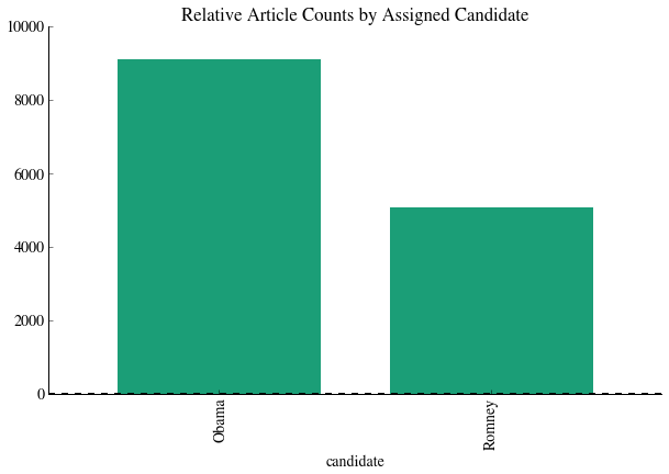
Following filtering and joining the dataset, we have a total of 35,274 articles.
We then visualized our dataset in a few different ways:


Sentiment analysis
The data that we have collected so far does not have an intrinsic categorization built-in like the Rotten Tomatoes data from HW3. Instead, we will use three different precategorized datasets to evaluate each article on positivity, subjectivity, and support.
The positivity dataset is a set of 50,000 IMDB movie reviews from Stanford (http://ai.stanford.edu/~amaas/data/sentiment/) that are presplit into testing and training data. While our dataset is composed of news articles, not movies, we will be using ngrams of at most length 3 and the general trend of whether a phrase connotes a positive feeling about a topic or not should be approximately the same.
The subjectivity dataset is composed of a set of 7419 IMDB movie summaries and Rotten Tomatoes reviews -- an IMDB summary is considered objective while Rotten Tomatoes data is considered subjective (http://www.cs.cornell.edu/people/pabo/movie-review-data).
The support/oppose dataset comes from 10,000 political speeches that were precharacterized into support/oppose. This should provide us with a "politically slanted" sentiment analysis that can expose or check back against the possibility that movie reviews are qualititively different in structure than political articles (http://www.cs.cornell.edu/home/llee/data/convote.html).
Vectorization
Having loaded in the training data, we then vectorized the data and convert it into a form that we can use for classification. There are two different vectorizers that we can use: CountVectorizer, which simply converts the string 'Romney is running for election' into a bag of words with a count of each word in the string. Tf-idf term weighting, however, re-weights the counts based on the frequency of words: e.g. words like 'the' or 'is' will receive a much lower weighting in the final analysis because these terms occur too frequently to be informative.
Naive Bayes Training
We then used the vectorized data to fit a multinomial Naive Bayes classfier. First, however, we split the three datasets into testing and training data. We then fit the classifier and reported the classification scores to determine the degree of overfitting.
In our preliminary analysis, we used a CountVectorizer with unigrams (single words only), then proceeded to Tf-idf vectorization with bigrams (single words + sets of two words). To score each of the different options for fit, we used both a quantitative tool (fit accuracy scores) and a qualitative tool (a fit visualization -- best fits should have a 1:1 relationship between P(positive) and actual % positive).
One example of a poorly fit dataset is below:

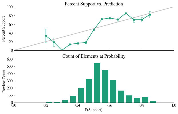

All three of these examples are poorly fit: we do not see a 1:1 relationship between the model and reality and the distributions of counts at a particular probability are basically unimodal.
Cross Validation
To improve the fit of this classifier, we can use cross-validation to determine the best constants for fitting. Cross validation in this context means searching a parameter space to maximize a score that relates goodness of fit of a model. We performed cross-validation twice: once to obtain a rough idea of the maximum location, and a second time to find that peak more exactly. We compared Tdif vs. Counts, unigrams vs. bigrams, alpha values (0-50), and min_df values (1e-5 through 1e-1). To visualize this search, we made a visualization of a contour plot of fit scores based on alpha, min_df, Tdif/Counts, and unigrams/bigrams. We also report below the best fit parameters for the data.

Positivity Post Cross Validation
| alpha | avg_score | min_df | ngram | scores | scoring_method | vectorizer | |
|---|---|---|---|---|---|---|---|
| 212 | 0.05 | 0.895300 | 0.000001 | (1, 2) | [0.895602087958, 0.897042059159, 0.893255730229] | testing_score | TfidfVectorizer |
| 110 | 0.05 | -4288.055188 | 0.000050 | (1, 2) | [-4330.25132721, -4234.31419617, -4299.60003994] | log_likelihood | TfidfVectorizer |
Support / Oppose Post Cross Validation
| alpha | avg_score | min_df | ngram | scores | scoring_method | vectorizer | |
|---|---|---|---|---|---|---|---|
| 236 | 0.05 | 0.753201 | 0.0001 | (1, 2) | [0.76425394258, 0.74322684998, 0.752122927618] | testing_score | TfidfVectorizer |
| 117 | 0.10 | -1291.768700 | 0.0001 | (1, 2) | [-1278.80734317, -1298.52353558, -1297.97522042] | log_likelihood | TfidfVectorizer |
Subjectivity Post Cross Validation
| alpha | avg_score | min_df | ngram | scores | scoring_method | vectorizer | |
|---|---|---|---|---|---|---|---|
| 225 | 0.10 | 0.924800 | 0.00001 | (1, 2) | [0.925314937013, 0.927692769277, 0.921392139214] | testing_score | TfidfVectorizer |
| 104 | 0.05 | -707.571337 | 0.00001 | (1, 2) | [-689.981885375, -695.881432056, -736.850693017] | log_likelihood | TfidfVectorizer |
Results Post Cross Validation
Following cross validation, these classifiers have greatly improved: there is much less consistent bias and the models are typically neither under or overconfident. A fit plot of the three datasets with optimized parameters is below:


Applying Training Data to Entire Dataset
Having found a model that predicts variance well in the training data, we now applied that model to the actual corpus of articles. The results were as follows:
In table format:
| probability_positive | probability_support | probability_subjective | word_count | |
|---|---|---|---|---|
| candidate | ||||
| Obama | 0.606889 | 0.401296 | 0.174573 | 742.270738 |
| Romney | 0.638615 | 0.403030 | 0.191612 | 864.380741 |
Graphically, we see very little difference between the media positivity in its coverage of Romney and Obama: the average scores are practically the same across the board and the distribution of scores is very similar.


Untrained Clustering
Another way of determining how related articles are is through clustering. In this example, we clustered by source. We then printed five different metrics to determine how clustered the abstracts are, where the abstracts are transformed by a vectorizer into arrays. We also used PCA with two components in order to display the data as an image, which gave us a reasonably estimated visualization for how closely related the data is.


In the first of the two clustering demonstrations above, we used a count vectorizer, which assigns a 0 or 1 to each word based on whether or not it appears in the abstract. In the second, we used IDF, which penalizes words based on how often they appear. The idea is that words like "a" or "the" should probably not be as influential as other words in determining appropriate cluster, but probably appear very often.
Note that in each example, the homogeneity (on a scale of 0 to 1) is quite low, meaning each cluster contains articles form many other sources. The completeness (also on a scale of 0 to 1), on the other hand, is higher. This means we are closer to achieving the goal that all articles from the same source are located within the same cluster. The fact that their V-measure - the harmonic mean of the two variables - is so low indicates that overall clustering on either vectorizer fails to adequately separate the data by source.
Based on experimentation with clustering on other subsets of the data, over different time frames, and on other variables besides the source, the general negative result is the same. This may be due to the fact that abstracts are relatively small amounts of text, so there may not be enough clues in any one abstract to distinguish which category it belongs in.
Media Favorability Scores and Polling

We created a time series of the RCP polling average and various methods of averaging our sentiment analysis measures. We tried multiple linear regressions as well as time series analysis. We ultimately concluded that normal linear regressions were ineffective at analyzing the correlation between polling and positivity measures because of the time-series nature of the data and lag effects. Time Series analysis proved more fruitful. We used Granger Causality between positivity measures and polling to try to find time-sensitive correlations. We found that changes in polling averages tend to precede corresponding changes in the running average of the positivity of print media coverage. All other relationships proved problematic or not statistically significant. We include the results of our final test below:
Granger Causality
number of lags (no zero) 1

ssr based F test:         F=3.1450  , p=0.0767  , df_denom=542, df_num=1

ssr based chi2 test:   chi2=3.1624  , p=0.0754  , df=1

likelihood ratio test: chi2=3.1532  , p=0.0758  , df=1

parameter F test:         F=3.1450  , p=0.0767  , df_denom=542, df_num=1


Granger Causality

number of lags (no zero) 2

ssr based F test:         F=3.0803  , p=0.0468  , df_denom=539, df_num=2

ssr based chi2 test:   chi2=6.2177  , p=0.0447  , df=2

likelihood ratio test: chi2=6.1824  , p=0.0454  , df=2

parameter F test:         F=3.0803  , p=0.0468  , df_denom=539, df_num=2


Granger Causality

number of lags (no zero) 3

ssr based F test:         F=3.0438  , p=0.0285  , df_denom=536, df_num=3

ssr based chi2 test:   chi2=9.2508  , p=0.0261  , df=3

likelihood ratio test: chi2=9.1729  , p=0.0271  , df=3

parameter F test:         F=3.0438  , p=0.0285  , df_denom=536, df_num=3


Granger Causality

number of lags (no zero) 4

ssr based F test:         F=2.7181  , p=0.0291  , df_denom=533, df_num=4

ssr based chi2 test:   chi2=11.0560 , p=0.0259  , df=4

likelihood ratio test: chi2=10.9448 , p=0.0272  , df=4

parameter F test:         F=2.7181  , p=0.0291  , df_denom=533, df_num=4


Granger Causality

number of lags (no zero) 5

ssr based F test:         F=2.2286  , p=0.0502  , df_denom=530, df_num=5

ssr based chi2 test:   chi2=11.3743 , p=0.0444  , df=5

likelihood ratio test: chi2=11.2564 , p=0.0465  , df=5

parameter F test:         F=2.2286  , p=0.0502  , df_denom=530, df_num=5
One must be careful to avoid overstating our case however. While we can state these two variables have a granger causal relationship, that does not mean true causality. If there is a 3rd variable that is causing both spikes in positivity and spikes in polling average, with different lag times (polling reacting before positivity), then that would create the relationship we have without there being a true causal relationship. However, this at the least establishes a time lagged correlation, and "hints" at a possible causation.